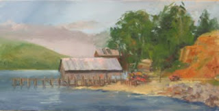
 This plein air painting done at Bodega Bay a couple years ago was reasonably successful, but the composition is not very strong. I wrestle with compostion...or at least the "rules" which I have always suspected are largely made up after the fact...but it's pretty clear that the focus of this painting isn't obvious. It struck me today that the large mass of rocks to the extreme right are contributing little to the painting. Additionally, they introduce a strong color that isn't anywhere else in the painting. Finally, the rocks force the tree mass into the 1/3 area, which is often the location of the point of interest. It struck me that they gotta go.
This evening, I took another photo of the painting but zoomed in a little tighter. I could have done the same cropping in Photoshop (I actually use Elements, but it's essentially the same thing but about $500 dollars cheaper!); however, the camera was what I had at hand. The picture is slightly darker than the original, but it's closer than the picture above. Anyway, I think the composition is much improved and the focus is now clearly the building. Admittedly, the roof stands out more in the darker version and that pulls the eye, but I think the location is also a contributing factor. This was painted on one of my cheap canvas panels that my artist friend Ruth ( http://ruthandre.com/ ) hates so much, but it will make it easy to cut down the original from 10" x 20" to something like 10" x 14". I'm headed out to the studio to do that right now. (I bought some better quality panels for the Bishop trip next month, Ruth!)

No comments :
Post a Comment