Monday, December 26, 2011

Another Studio Painting from a Smaller Study (Updated)

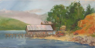
Two years ago, on a dark, rainy spring day I was going stir crazy sitting in the house.  I grabbed my camera and went looking for photo opportunities.  As I pulled into Fair Oaks (often referred to as Fair Oaks Village) the sky opened up and the rain came down in buckets.  The warm light from the window of the coffee shop contrasted with the dark afternoon skies and the wet streets.  I snapped several pictures.  Later, using Photoshop Elements, I pasted several shots together to make a panorama.  About a year ago, I did a small study of the scene which I liked.  While I've been loafing around the house all of the month of December experiencing and then recovering from some health issues, I pulled out the study and decided to do a 24" x 36" version.
Rainy Afternoon in Fair Oaks Village  Oil on 24" x 36" canvas


I think it's about done since I've reached the point where I'm not sure what else to do.  I'll let it sit for a week or so and then decide.   Once again, I'm having a lot of trouble getting a good photo of the painting.  I'm not sure why, but I suspect my camera is at least part of the problem.  The other is no doubt the operator.  Anyway, this picture is a bit warmer than the painting, but it's not too far off.  Also, once again, Blogger is clipping the picture edges.  Click on the picture to see a larger and complete version of the painting. 

UPDATE:  I finally quit blaming my camera (Canon A570 IS) for my bad photographs and begin to try to do something to improve.  I went online and read a number of informative articles on taking digital photos of artwork.  Very helpful.  I also spent some time on a proper photo 'setup' including some tungsten lighting.  I now am thinking that I need to built or buy a "wall easel" mounting system and install it permanently for the sole purpose of photographing my paintings.  Finally, using information from the articles I mentioned, I searched my camera for some of the settings mentioned and - what do you know - found them!  It all made a huge difference.   This new photo of Rainy Afternoon is VERY close to the original. 


Friday, November 11, 2011

Painting From A Painting - UPDATED

In my previous posts, I described my recent trip to Ft. Bragg and Mendocino for a painting workshop.  The last painting I did was on the bluffs above the Pacific just mile or so outside of Mendocino.  I liked the painting quite a bit and I decided to paint a bigger version in the studio.   I was disappointed to find that the photos I took that day were almost useless...completely washed out.  My camera is an inexpensive point and shoot, but ususally gives me decent pictures.  In this case, I suspect I had the camera set on manual unknowingly.

I decided to forge ahead using my 16 x 12 plein air original.  I've included it at the bottom of this post.   


I chose a 24"x36" canvas that had an old, very bad acrylic painting on it.  Several weeks ago I had covered the canvas with a  wash of white oil paint so it was handy and ready to go.  Just as I had done with the plien air painting, I started with a red / orange tone of middle value and then started to sketch directly with the brush.


Morning on the Mendocino Coast   Oil on Canvas   24" x 36"

This painting really "flowed" for me.  I covered the entire canvas with basic form and color during the first session of about 2 hours.  I felt like I was doing a plein air painting again, quick decisions, rapid coverage, broad shapes.  It just felt like I knew what the next step, the next color would be, maybe because I had already done the painting in plein air.  This was a fun painting and I looked forward to each session to add a bit more.  It's interesting how different the paintings are...the newer studio version is really done from memory, with only the original plein air painting to help. (I've noticed that this picture is clipped when displayed on the Blog page.  If you click on the picture, you'll get a larger, complete version.  Wish I knew why that happens.)

Here's my "model"....


Wednesday, October 26, 2011

Third Day in Ft. Bragg.

I set up on the top of a cliff above the crashing ocean.  It was very early and the faces of the cliffs across the way were still quite dark.  The light from the East (right) was skimming across the top of the bluffs beyond and striking a single white building among the trees.  A bit of it caught jutting surfaces on the steep cliff face directly across from me.  I loved the light and the mist that still remained and I tried to capture this.  By the time I was finished the scene had completely changed, but I tried to stick to the original scene and I think I got it pretty well.  I like this painting.

I begin with the intention of trying for a bold painting.  I wanted contrast and color.  To set the theme, I toned the canvas in reds and oranges in a mid value. 

Unfortunately, I'm having a very difficult time getting a good picture of this painting.  For one thing, I find that the camera sees 'blotches' that the eye blends.  The result is a much more 'quilted' effect in some areas.  Contrast is also an issue.  In the actual painting, the face of both cliffs are a step or two darker which in turn makes the areas of light at the top of the far cliff and in the mist much more dramatic as a result. 


The snap shot at right shows my start, including some 'scribbles' ala Harley Brown.  If you look closely, you'll also see that I've started to sketch in the lights and darks and basic shapes.  You can also see that I've indicated the house that I've already decided will be an important note. Taped to the side of the palette is the thumbnail sketch that helped me settle on the basic scene.  I rarely refer to the thumbnail once I've started painting, but it is valuable for establishing the composition. 


The Mendocino coast
If anyone wonders about the allure of plein air painting, these photos should provide the answer.  WOW!


Vicki waits for the verdict, which was..."Outstanding"


In this picture, Howard decides to do a watercolor which turned out disgustingly well.  I think he's done them before! http://howardreesartist.com/index.html

Monday, October 24, 2011

The First Day in Ft. Bragg Continued

In the afternoon the sun shifted to the west, of course, and we were able to now look east toward the Noyo Harbor area.  There are a lot of great structures and boats here.  Enough material for days of slopping paint on canvas.  The main challenge is finding a spot to set up and to get the light right.  On this day, I painted from across the river.
I really like the scene.  I think I took several photographs so I should be able to tackle another version in the studio.  In this case I used a 10" x 20" canvas panel.  I like these 1:2 ratio canvas sizes. They are perfect for landscapes.  I wish I had brought more for the trip.  I feel that the buildings on the left are a bit weak.  I may see if I can punch them up a bit with some contrast.  The light was coming in from the west (right) and it was bright and intense.  I didn't really capture that...but I should be able to add it now without much reworking.

All in all it was a great first day at Ft. Bragg.  Beautiful weather and great landscapes to challenge any artist to do their best.

 Ruth Andre on the first day.  She had a very successful trip.  Ruth's fabulous blog and her posts on our Ft. Bragg workshop can be found here: http://apaintingday.blogspot.com/


Barbara found a great spot, but without an umbrella, that sun was BRIGHT!   Barbara and her husband Mario had just returned from New York where Barbara had a one-woman show.  The competition on these workshop trips is getting fierce!  Here's Barbara's website...you'll see why she was having a show in New York!! 
http://barbarafracchia.com/


Ted gets going on day 1.  The sign isn't kidding, especially if Ted has brought along Thalo Green.  Ted had a great trip and managed to do one of the best paintings of the four days.  We didn't take a vote, but if we had, Ted would have gotten the prize, I think.

Sunday, October 23, 2011

Supporting the Locke Foundation

If you read this blog, you know that Locke, California is one of my favorite places to paint.  It's also the home of several of my artist friends including Martha Esch, Ernie Wester and Chris Spencer.   Going to Locke is always a treat...and of course a beer and hamburger at Al the Wop's is required.

The Locke Foundation is the Locke town council and they raise funds for improvements and historic projects in the little town.  Saturday was the Harvest Homecoming Festival, a fund raiser that included Chinese singers, dancers, a chinese orchestra and, of course, Chinese FOOD!  A great time!!


I donated three paintings that I've done over the years in Locke.  All of them sold in the silent auction!!  I was very pleased to contribute the proceeds, and also pleased that they all sold!  How about that!?? 


I could only find pictures of two of the paintings and they are included here.  Both were 12 x 16 I believe. The one on main street was painted during the annual chili cook-off on stretched pre-toned canvas.  Painting while your insides are being dissolved by incredibly hot - and delicious - chili is a challenge.  The tequila shots that many of the chili vendors pass out as bribes to vote for their chili don't help a lot either.  The painting of the buildings in the alley behind main Street was done on a toned canvas panel.  I've always liked this painting.  I used black acrylic gesso to sketch the scene and also to block in the darks.  The rest of the painting was done in oils.  This black gesso technique gives a painting a lot of contrast....something my work can sometimes lack.  The gesso is also really nice to paint over with oils...Take a look at the handrails painted over the black gesso in the lower left of the painting.  I like the effect.  The third painting not shown here was also painted from the end of Main Street during the Chili Cook-off a few years ago.  It was a large painting done entirely on location.  I think the beer helped me see it through

 Don't miss a chance to visit Locke if you get it!!

Wednesday, October 19, 2011

In Ft. Bragg with the Group

Once again, I attended a workshop presented by Howard Rees, Jackson California artist, and once again, it was a gathering of good friends - this time in Ft. Bragg California.  Many of these fellow artists have been mentioned in my earlier posts, but I'll sprinkle pictures of them here and there as I present our four days of painting in the next few blog entries.
Our weather couldn't have been better for the entire trip.  The days were warm and sunny with cool mornings and evenings that were easily handled with a light sweater.  I marveled the entire time at how lucky we were.  Some members of the group had been in the area the previous week and reported heavy downpours for days on end, but for our visit we could not have ordered up better days along the rugged and spectacular Mendocino, Ft. Bragg coastline.

On the first day, we painted right below our hotel balconies in the Noyo Harbor area.   I believe I am right in saying that this is a harbor formed by the meeting of the Noyo River with the Pacific Ocean.  The harbor is surrounded on all sides by high rock cliffs, some covered with trees and forest, some craggy and stark.  The intense early morning light from the east forced me to face toward the ocean (west) and look for painting opportunities there.  There is so much to see when you look out to the ocean...distant cliffs, rock pounded by surf.  It's immense and can be almost overwhelming.

I decided to paint the massive cliff face at the very point that the ocean meets the river.   The early morning light was coming in strong and low from the left and raking across a few jutting areas of the cliff.  I wanted to capture that light while painting the rock boldly and quickly. I knew the scene would change rapidly and soon the whole cliff face would be in sun, so I sketched directly with the brush on a white (untoned) canvas panel.  All the while, I made an effort to remain clear in what I wanted to paint - in other words, I had a plan, something I so often forget in the rush of plein air painting.  I made a special effort to sketch exactly the areas where the light struck the sloping rock face in the lower left and the very tip at the top of the cliff before they changed.  
Noyo Harbor Cliff, Ft. Bragg, CA


This was the result and my first painting of the trip.  It's oil on canvas, 12"x16".

Frankly I was very pleased with the result and consider it one of my best plein air efforts in awhile. I love the colors and I felt that I maintained some restraint and correct values in the light. 


On the same morning, Andy (left)  and Rusty (below) paint similar scenes. If you look carefully at the picture of Rusty, you can see the same concrete seawall that appears in my painting (extreme right). 

Tuesday, July 19, 2011

Fiddling Around with Nero

Last weekend I decided to try the Wetcanvas.com Portrait forum Challenge for July and August.  I shouldn't have.  The challenge turned out to be to paint from a sculptured bust with several to select from.  Foolishly I bypassed several lovely young ladies to take on ....yep....Nero.  That's where my troubles began.  Mistake #1

Day 1 the pencil drawing using a grid
The first day I printed out the subject using standard printing paper rather than photo paper.  Mistake #2.  The picture printed out dull and without the rich look of the original bust.  I didn't care since I convinced myself the print was only for the purpose of copying the head onto canvas and that the painting would be done from a computer monitor or iPad.  Using a grid system, I transferred the 8 x 10 photo to the 9 x 12 canvas.  I had a new panel from RayMar I wanted to try...triple primed, very smooth cotton canvas.  Nice stuff made for portraits. Wow it's easy to draw on too.  I rarely use pencil, preferring to draw directly with the brush but I wanted to proceed carefully so I drew it out. 
In an hour or so on the first day I had it blocked in.  I was OK with the progress. 
Day 1  the block in started. 

The second day I worked another hour or so to begin to refine the image a bit.  I find the block in stage to be the part of the process I like the best.  It always seems to go downhill from there. I was using synthetic sable for most of the block it.  For several years, I've used bristle entirely, but I'm beginning to move away from that. 

 
Day 2 Refining the image a bit


On the third day, I worked on getting a likeness while at the same time trying to paint a "statue" and not a real face.  I want this to look like a sculptured bust. In particular I wanted to correct the chin which I had much to far to the left.  At the end of this session, I was pleased with the general progress and the likeness.  I should have quit right there, but of course - Mistake # 3 - I didn't.  In looking at the painting, and more specifically, at the photos of the painting, I could see several issues.  The primary one wasn't a drawing problem -although there were a few of those at least -instead, I didn't like the color.  Somehow I had drifted into a very greenish cast to the shadow, no doubt a result of using unbleached titanium as a primary base color and adding ivory black for shading.  The mixture results in a green, which I should remember for landscapes, but which is unpleasant in a portrait.  (It looks better here than it did in life.)  Anyway, I decided I wanted to 'repaint' the bust to get closer to the richer base color and to get to a cooler, bluer gray in the shadows.  Not to mention that by now my new Isabey mongoose brushes had arrived and I was dying to try them out for the first time.   A perfect excuse to Fiddle with Nero some more.

Need I say it?  Tune in for the next post in which I manage to take four giant steps backward without saying "Mother May I?"

Sunday, July 10, 2011

Sunday Afternoon

It was a lazy Sunday afternoon today in Sacramento.  Hot and beautiful as the summer always is here; however I was at loose ends until I remembered the July Challenge! in the Southwest forum on Wetcanvas.com.   Sure enough there were some great pictures to choose from this month.  One was this old place located in O'Donnell Texas. I'll have to look that up on Google Earth.  I'm not sure what part of Texas it is...although it sure looks like West Texas...maybe even Judge Roy Bean country!  Anyway, I can't resist these old shacks! When I see them in person, I can't help but think about the lives that were lived there. I got the photo on my iPad and went out to the studio. I painted for about an hour, went off to do some yard work and shopping, then returned for about another hour to work on the already setting first coats. (In the dry heat, the oil really sets quick...and I was using Liquin today too.)

Here's the photo uploaded by Kay of the Southwest Forum.  She had several good pictures to choose from this month.  (I hope she doesn't mind me using here photo here.  Here's a link to Kay's fantastic blog (http://kaysmithbrushworks.blogspot.com/)
as a bit of a thank you!)


Shack in O'Donnell Texas   Oil on 8" x 16" panel
I picked an oblong canvas because I wanted to put some prairie behind the little shack and create a sense of space and, of course, loneliness.  (There's actually about another 2" of the painting on the right, which shows in the preview, but not in the final post.  Agggghhh... I think it does a lot to give a feeling of vastness and emptiness.  Here's a smaller size to show you what I mean..)

I moved the Yucca plant (tree??)  and added a window and door to the exposed face of the cabin.  (Love those tall skinny windows!)  I made the Yucca the focal point which then hopefully leads one to the more complicated cabin.  I exaggerated the roof lines intentionally to add a bit more drama.  I like the way it came out...and I was glad that I decided to get out into the studio and make it a Painting Day, as my Artist Friend Ruth Andre says on her blog ( http://ruthandre.com/blog ). It was a good Sunday all around. 

Wednesday, July 6, 2011

Final day in Bishop

Our last full day of painting in Bishop found us alongside a country road outside of town.  The mountains in the distance were beautiful with snow still on top.  Ruth Andre (ruthandre.com) and I set up and painted these trees to start the day...


Outside Bishop  Oil on 12" x 16" canvas panel
 It was a simply gorgeous summer day...yes, it was hot, but it was SUMMER!  After the long drawn out winter/spring this year, it was glorious.  Immediately in front of this scene between the easel and the trees an irrigation canal flowed.  Just a few feet away, at the source, it was much wider and partly concrete lined.  About noon or so two bicyclists came by, stopped and hopped into the cold clear water.  It looked wonderful!  And it reminded me so much of growing up in Fresno and swimming in the canals in the summer...and sometimes even the San Joaquin River.  Wow those were wonderful days.  I think this painting was the most successful of my Bishop trip.  Perhaps listening to the swimmers in the cold clear water as I painted had something to do with it!
Eastern Slope   Oil on 12" x 16" canvas panel


After lunch, I set up under some nearby trees and tried to paint the distant mountains.  I didn't catch the intensity of the high desert light in this picture, but overall I was pleased with it.  It's the kind of "pure" landscape that I always have such trouble with, so I felt that it was not too bad with that in mind. 


We did paint one more morning before heading home around noon, but my painting wasn't successful at all.  The real highlight of the last day was watching the local kids come down to swim in the Mill Pond and to use the rope swing tied to one of the big trees overhanging the pond.  Growing up in a small town definitely has its compensations.  With that it was goodbye to Bishop and my artist friends until next time.

Monday, July 4, 2011

Bishop Workshop Continued

On the second day of our workshop, we visited the Laws Railroad Museum.  Among RR and history buffs, the narrow gauge Southern Pacific branch that served the high desert area is well known.  The museum has only one locomotive and a string of cars, but it is full of old structures, machines, steam engines, and of course the famous Laws water and oiling tanks.  There was just too much to paint.  During the day, the wind kicked up, blowing sand and debris into the air...and into paintings as well.  It was challenging.  I was pleased with the performance of my easy...I never felt it was going to blow over.  I think two of my fellow painters french easels did go over...and I know that at least one painting went into the dirt jelly side down.  I did have to close up my umbrella a couple times as a precaution.  I was intrigued by this old Ford sitting at an ancient gas pump.  It was in full shade with brightly lit buildings behind.  That was the look I wanted to capture...the car and foreground dark with brilliant sun behind.  The painting feels very unfinished to me, but I think the design worked out OK.

Laws RR Museum 1932 (?) Ford  12" x 16" oil on panel

Narrow Gauge Pulling Into Laws   Oil on 8" x 16 " panel
After lunch and when the wind had died down, I tried to capture the line of cars behind the narrow gauge locomotive.  It was almost as though the train was pulling into the Laws Depot (another wonderful relic on the museum site).  But I no sooner got set up and started a block in than it was time to quit.  It seems the Museum closes at 4PM each day, so we did our critique at about 2:30...earlier than usual.  I got caught with nothing more that this little study.  (Sorry for the lousy photo...I'll see if I can't get a better one,) This isn't much of a painting, but I've posted it just to be honest about the struggle that goes on when painting outside.  Time, light, wind and early closing all can work against you!


At the left are the water tank and oil tank for the little narrow gauge locomotive- which no longer runs.  Though they don't show well in this photo, they are well known structures to RR buffs. I love the way they are silouetted against the Eastern Sierras.  I can almost hear the whistle and the chug chug of the little locomotive.  I would love to return to Laws to paint.  The opportunities are almost endless. 

Monday, June 27, 2011

Painting Workshop in Bishop

Once again, I signed up for a workshop with friend and professional artist Howard Rees (http://howardreesartist.com/) to do some outdoor painting.  After a winter of stagnation and too much work at the office, it was time to force the issue and sign up for a workshop and get painting.  It's a good thing I also paid a deposit for the workshop because if I hadn't I probably would have cancelled at the last minute.  As always seems to happen, work demands reached a crescendo just before the workshop and I felt that it was nearly impossible to get away.  However I've lost deposits on workshops before and this time I decided to hell with it...I'd go and things would work out or not.  As it turned out they did work out, but I still spent the end of each painting day logging into the office to catch up.  Not sure if internet and cell phone access is a blessing or a curse!

So it was off to Bishop to paint the high desert and Eastern Sierras and see many artist friends once again.  My friend Ruth Andre (http://ruthandre.com/) joined the group and others who I've pictured in earlier posts on this blog were also there.  Rusty and his wife Elena, Renee and Noni down from Port Orchard, Washington, Vicki, Bob, and others I will think of as soon as I close this post were there.  The weather was perfect for most of the trip.  In fact, these were the first real, hot summer days I'd experienced this year.  As a life long California Valley summertime kid, I never thought I'd be saying those words in the middle of June!

At the end of each day, we'd gather around and Howard would 'critique' each person's work.  Here's the group getting instruction and criticism from Howard at the end of a painting day.  This happened to be day 3, I think.  In this picture, Howard stands back to critique his critique.  He loves to paint on everyone else's painting.  I think that's cheating.  I could do better too if someone else did most of the work first.  But I don't tell him I said that.  I paid for this abuse and I insist on getting it all.

In reality I have mixed feelings about having my work painted over, but I have to admit that after so many years of experience, with a few quick brushstrokes, Howard can do magic on a painting.  It's always a treat to watch him bring a painting to life in minutes.  It's even more of a treat if it isn't my painting!


During the critique, Rusty (in red) looks skeptical while Ruth, somewhere under the hat at the left, is not paying attention as usual. Renee (between Ruth and Rusty) appears to have dozed off in the middle of all the excitement.


Pond at Bishop Ca  9"x12" oil on canvas panel

Day one was a lot about getting the rust out.  I started with a very poor imitation of you-know-who.  I won't say his name since he might not appreciate being associated with this.  Some "Howard" advice that improved this painting: de-emphasize the group of lily pads in the distance so that the group in the foreground became the focal point.  I had both groups in sunlight, and both painted in light values.  Darkening the distant group worked, in my opinion.


12" x 16" oil on canvas panel. 


In the afternoon, I looked for some architecture to paint.  I find it very difficult to paint "pure" landscapes. Architecture of some sort helps provide color, contrast and sometimes a center of interest.  I painted the only two sheds nearby the ponds.  Howard really rescued this painting for me when he suggested adding the trees in front of the building on the right.  It covered a very plain area and added some reasons for shadow areas in the foreground.  I spent many years in architectural drafting and rendering and you'd think I'd remember the most basic architect's trick....put trees and other 'growies' in front of ugly designs.  They do wonders.  It worked here too.  I had also painted the shed to the left head on...exactly as it appeared to me, but Howard pointed out that while it was "real", it looked odd.  With just a couple of brushstrokes he added a suggestion of a side wall on the extreme left of the shed, giving it a sudden third dimension. 

After these two paintings I was done for the day and ready for a beer...or two.  I was already looking forward to the next couple of days!

Saturday, June 25, 2011

Breaking in the EasyL plein air easel

After about six years of wrestling with a french easel, I decided to see if I could find something more portable and easier to set up on location.  The french easel is a marvelous bit of engineering, but it is heavy, not easy to carry far from the car and very frustrating to set up, even on level ground.  (A pair of pliers and a screwdriver soon become essentials to pack in your easel.)  I looked at a lot of advertisements and reviews on "pochade boxes", lightweight aluminum a-frame easels, etc and finally settled on the EasyL from Artwork Essentials.  Now that I've had it for awhile and I was able to take it along on an extended painting workshop, it's time to evaluate it.  I liked the EasyL from the beginning, but four days of setting up and taking down out in the field have convinced me that I made a good choice. I haven't used any of the other popular plein air setups, so I can't compare, but I think this one would be hard to beat.  Here's my "review" ....

This is the general setup, shown in the wilds of my backyard.  This happens to be the Versa model, which I believe is the largest they make.  It will easily handle a 16"x20" canvas or panel.  It's hard to see, but extending downward from the top of the tripod is a small hook on the end of the vertical height adjusting column.  This hook turns out to be a fantastic idea.  By hanging a bag with a few rocks in it, or by hanging a backpack, as I do, the easel becomes very stable.  It would take a very strong wind to tip the EasyL when something heavy is suspended from the hook.  Great feature!  During my four day workshop, we had one day of pretty strong winds.  I never worried for a moment that the easel would blow over, although one or two french easels belonging to fellow painters did.  Over all the EasyL gets high marks for stability, especially when a weight is suspended from the bottom hook.

Here's the brush holder and the hook that holds my leak-proof turps container.  Two of these hooks come with the easyL at no extra cost. The brush holder is extra, but almost essential. 


I think the major advantage of the EasyL over other well known pochade boxes is shown in this picture.  The palette can be set at an angle so that you can look down at it as you are painting, while the painting can be set perfectly vertical or even sloping slightly away if you prefer.  This is a huge plus for me.  But even more importantly, the canvas is raised above the palette.  You don't have to rest your arm or dangle your sleeve in the paint while working on the canvas.  Very functional and convenient.

The picture below shows the rear of the easel.  The mast raises to accommodate good sized canvases or panels.  This is a 12h x 16w panel and you can see there is room to spare.  The mast locks in place once it is adjusted to the top of the panel.  There are also two slots for carrying wet panels. 


I also purchased a new umbrella for the easel.  I'll have some thoughts on that in a future post.

Happy Painting!

Sunday, May 29, 2011

A Lesson in Cropping and Composition

This plein air painting done at Bodega Bay a couple years ago was reasonably successful, but the composition is not very strong.  I wrestle with compostion...or at least the "rules" which I have always suspected are largely made up after the fact...but it's pretty clear that the focus of this painting isn't obvious.  It struck me today that the large mass of rocks to the extreme right are contributing little to the painting.  Additionally, they introduce a strong color that isn't anywhere else in the painting.  Finally, the rocks force the tree mass into the 1/3 area, which is often the location of the point of interest.  It struck me that they gotta go.

 This evening, I took another photo of the painting but zoomed in a little tighter.  I could have done the same cropping in Photoshop (I actually use Elements, but it's essentially the same thing but about $500 dollars cheaper!); however, the camera was what I had at hand.  The picture is slightly darker than the original, but it's closer than the picture above.  Anyway, I think the composition is much improved and the focus is now clearly the building.  Admittedly, the roof stands out more in the darker version and that pulls the eye, but I think the location is also a contributing factor.  This was painted on one of my cheap canvas panels that my artist friend Ruth ( http://ruthandre.com/ ) hates so much, but it will make it easy to cut down the original from 10" x 20" to something like 10" x 14".  I'm headed out to the studio to do that right now.  (I bought some better quality panels for the Bishop trip next month, Ruth!)

Saturday, May 14, 2011

Remembering School House Beach

White Shirt  20 x 16 Oil on Canvas
I've painted several times at School House Beach in Bodega Bay California with a group of artist friends.  It's a wonderful place with something incredibly scenic waiting around every corner.  I've painted School House Beach in wind and fog and bright sunshine, from the surf line on the beach and from the top of the cliffs.  There's always something picturesque to capture the imagination.  On this day it was bright sunshine with the morning fog all but gone.  On the beach, fellow artist Rusty Wallace found a spot and was well into his acrylic painting when I walked by.  I was struck by the brilliant white of his shirt against the sea and sky...and by the incongruous choice.  What courage to wear a white dress shirt while painting!  I snapped several photos of Rusty.  This is from one of them.  I have some work to do on the foreground, but otherwise, I'm close to calling it done.  20"x16" oil on stretched canvas

Saturday, February 26, 2011

Painting a Cherub

How can I resist a face like this?  What fun. It's oil on 12" x 9" canvas panel.  It is painted over a really badly done landscape (by yours truly of course), so I feel much better about it now...even though it was a cheap canvas!

About 3 hours total in three brief sessions. 

Sunday, February 6, 2011

Water, water everywhere....

and not a drop to drink!  But there's plenty to splatter on my painting, my shirt, my neighbor's painting, my reference pictures and ...well, you get the idea.  Watercolor is SOOOOOOOOOOOO different than oil painting.  You'd think that there would be some crossovers.  After all, both use brushes to put color on a surface...and even the names of the colors are the same!  But as I am learning in Jeannie Vodden's watercolor portrait workshop, common color names is right where the similarity ends.  As I've mentioned before, I am not completely new to watercolor, but it's been so long since that earlier foray into washes and sable that it might as well have never happened.  As I watch Jeannie's carefully applied washes I marvel at her control...the way she moves the color down the paper, adjusting it as she goes - warm here, cool there - never breaking the momentum.  Back at my station, my oil painting hand takes over and I work back into washes and marvel at the unplanned blooms that result.  My wash dries before I'm done washing, and although I know I can't do it, I inevitably work back into still wet passages.

I know that Jeannie's careful, even meticulous style is not something I'd ever master, but she is a great teacher, patient, full of information freely shared, and very encouraging while being totally honest. I'm enjoying the workshop....now if only I could paint a watercolor.

Here's a little sketch of Howard Rees.  I started out using Jeannie's methodology, but in the end, I went back to my oil roots and violated just about every rule in watercolor.... transparency and spontaneity be damned!

First some light "rainbow washes"
Then glazing to add form


Then revert to Oil Painter


OK, so I need to re-work on one of the eyes a bit.  So would someone tell me how to do that in WATERCOLOR??!

Sunday, January 16, 2011

Red Rock Country

Once again, the Southwestern Art forum on the Wetcanvas website supplied the challenge and the photos.  I combined two beautiful pictures taken by artist John Tubbs and posted on that site...one a beautiful shot of yellow gold clouds over the mountains and the other of a gnarled pine in Bryce Canyon.  I combined the two photos in Adobe Elements after flipping the pine for composition purposes.  I reused a canvas with an old plein air painting on it...something I'm going to do more of simply to try to keep from adding to the stacks of paintings everywhere I look around here. 

This painting is quickly done in two short sessions.  I didn't follow a logical progression by first painting a complete sky and cloud background, letting that set up and then painting the tree.  No, that would have made too much sense.  Instead I worked on the tree and sky simultaneously, creating a nearly impossible muddle and a zillion 'sky holes' to paint.  The painting is not done, obviously.  I'm not sure if I'll spend more time on it or not.  I really like the composition...I took a lot of liberties with the photo reference and I think the painting composition is more than the sum of the two references.  On the other hand, the subject matter could be much more refined and finished.  In the end, I might just stop here and use this as a reference and study for something larger.  We'll see. 

It's oil on canvas.  16"x12"