Friday, November 26, 2010

Portrait of a Redhead

The online art 'community', Wetcanvas.com, has a forum on portraits that I visit on and off.  With the rain and cold weather, it's beginning to be more on than off.  There is a monthly 'challenge' in the portrait forum where someone posts several photos and everyone is invited to paint one or more in their favorite medium and style.  I haven't done many portraits this year and I felt the urge to get back to it.  This month featured an unusual looking redhead and I decided to give it a try.

establishing "landmarks"
I had a stretched 20" x 16" canvas of fairly smooth texture and I had toned it with a raw sienna previously.  I started out in the usual way with a direct sketch using a small brush and a reddish brown mix slightly darker that the canvas tone.  I sometimes use a gray for sketching, but more and more I like a warm tone closer to the colors of the subject.

I sketched carefully, trying to get the 'landmarks' in the right places. This is such a critical step in a portrait.  I try not to rush it, but I am an impatient painter and it's always a struggle to resist plunging into the 'good stuff' too soon.  As I write this, I realize that I didn't do much measuring during the early sketch, and, predictably, this lead to some problems later.   Portrait painting is a process with definite steps.  The earliest sketch is a critical early step.  Rush it and you'll struggle to find a likeness for the rest of the painting.  I did.  


Developing forms and establishing darks
My favorite part of any painting, portrait or landscape, is the drawing.  I love to draw with a brush and often I am tempted to quit at that point!  With landmarks established (incorrectly in several places) I begin to draw in the shapes more fully, still using the reddish brown mix.  I added shadow areas as if sketching with a pencil.  It would probably be more 'correct' to just begin to add the darks and halftones in color rather than shading with the sketch color and brush, but more and more I've begun to take this extra step in the sketch.  Because getting a likeness and accurate drawing is dependent on the spaces between landmarks - hairline to eyebrow, eye to hairline at temple, bottom of nose to upper lip, and so on - putting in the shadows and halftones this way helps find any areas that are badly drawn or that have missed the likeness significantly. 


Adding lights


Now I begin to add color, starting with the darkest darks.  Since these are primarily in the hair, I mix a burnt sienna, cad orange and add ultramarine for the darkest areas. Although I shouldn't have, I couldn't resist adding some lights in the hair to begin to give it body.  The darks in the face should have been added next - the left side of the face, under the nose and lower lip - but with the shading from the sketch defining these areas and giving them shape, I ship right to some of the lightest lights.  Once again, in hindsight, this is 'out-of-order' in the process.  The correct approach would have been to paint the darks in the face, follow with the mid-tones and finally add the lights, but being a bit out of shape painting portraits, I wander haphazardly.  I know better, but sometimes it's easy to deviate from what we know and instead, do what we want.

At this point I am conscious that the shape of the face in not correct and that the head seems slightly wider than the model's.  It's inevitable that this will happen when the sketch phase isn't done with patience and accuracy.  I decide that I can correct that by moving the ear in from the right and by continuing to work on the shape of the forehead, cheek and jaw by negative painting with the dark passages of the hair in shadow.   At several points in this painting, I wipe out whole sections with a paper towel dipped in OMS.  The smooth canvas makes this much easier, thankfully. 


Finally, I add a simple background after adding in the midtones and lights in the face.  I really don't like the blue after I put it in.  I think the warmer background was better, but I'm committed at this point, and since it's just a study, I'll probably leave it as is.....


"Mairen"  Oil on Canvas  20" x 16"


Saturday, November 20, 2010

Rainy Day in the Studio

A plein air trip planned for Sloughhouse was rained out today, so I retreated to the studio for a couple of hours while the rain came down.  I used a photo generously posted in one of the "Monthly Challenges" on Wetcanvas.com.  I liked the light coming from the single source to the right.  The rest of the painting was very dark.  I tried to stay loose and throughout the painting.  The canvas panel that I had handy already had a tone of raw umber, so it was quite light.  I started by making a quick sketch with a brush and burnt sienna.  As I went along, I wished I had spent a little more time on the sketch.  It might have made what followed easier.  I blocked in dark areas with burnt sienna and a bit of ultramarine blue.  I did a lot of negative painting in this one, painting around shapes such as the stirrup and belt. I also tried to add thick darks in spots...and that's where a more accurate sketch would have been helpful.  During most of this painting, I kept thinking about carving the saddle out of the dark background. 

The photo has a little light reflection in it...it was photographed with only overhead florescent light which washed out the top portion somewhat.  In particular, the rope appears much lighter that it is in the painting. Total time, about 1 1/2 hours

Saddle  12" x 9" Oil on canvas panel

Saturday, November 13, 2010

Struggling with Green!

On a recent day with artist friends Ruth Andre and Howard Rees, I painted in the Gold Country near Sutter Creek, Drytown and Amador City.  I posted my plein art paintings earlier.  I was very disappointed with the results that day.  Both paintings were very mediocre, and the first one was just plain bad.   From the emerald green of the gold country in winter and spring to the dark muted green of the valley oaks, I've always struggled with green in landscapes. 

I've decided to study greens in landscape painting, and although I've just started, I'm beginning to understand the issue a bit.  I found a very nice, if a little bit technical, article on line about seeing and  mixing greens.  It was aimed at the watercolor painter, but I think the challenges are somewhat the same.  I'll find the link and post it here later. 

First, I bought a couple of additional colors to experiment with.  I've started to make some color charts and I wanted to have a bit more variety for mixes and added colors.  In addition to the colors I already have, Sap Green, Cad. Yellow Lt., Cad Orange, Ultramarine Blue, Yellow Ochre, Cerulean Blue and Hansa Yellow, I bought Thalo Blue, Thalo Green, and Ivory Black.  I haven't used black before, but in reading about mixing greens, I have come across a number of references that recommend it for a neutralizing color.  In fact, when mixed with yellow in the right proportions, it's possible to make a muted and useful green.

After playing with the mixes for awhile I decided to take another try at the barn scene I had attempted in plein air.  I set up my EasyL in the studio, but the photo of the scene on the computer monitor and took a shot.

The original scene was strongly lit from the left with mid morning sunlight.  The tops of the trees and shrubs were raked by the light, while the left side and bottoms were in deep shadow.  On site, I allowed the entire painting to become very high key and I lost any contrast.  The shadows were just a mid shade of green.  There was so much bright sunlight that I think I was a bit overwhelmed by it.  To top it off, I was standing in the sun without an umbrella.  To shade my canvas, I more or less faced the sun. I've made that mistake before, but this time it resulted in the painting being too light.  The usual outcome of painting in bright light is a painting that tends to be too dark. 
The original plein air study. 
  Anyway, whatever the cause, the painting was a mess.....


In the studio, there were several things I wanted to accomplish with the new painting.  First I wanted to work with the greens.  I wanted much more contrast in the entire painting, and I wanted the barn to be the clear center of interest.  I wanted to darken the entire color key of the painting as well.  For the greens, I went much darker, using thalo blue in mix.  I also used black sparingly to lower the color intensity while staying on the dark side.  It was only when I was nearly done with the painting that I realized that I had used almost no white in any of the mixes.  The exceptions were the tin roof of the barn and the hill top on the left.  There's no white in any of the green mixes.  Most were lightened with Hansa Yellow (I didn't use my old faithful Cad Yellow Lt., either.)  I think leaving out the white and using a less intense yellow throughout the painting was an improvement...and an eye  opener too.  I am over using white in all of my paintings, and I'm going to try to cut down.  I was amazed at how little I used in this painting.

I like the second attempt much better.  Although it was done in the studio, I did it very much as though I was in the field...using my EasyL and glancing at the computer monitor for reference.  I actually spent less time on the studio version than I did working on location...just about an hour total.  That may be another improvement.  I've also noticed how much the feeling of the painting is changed by simply extending the background hills past the top of the painting, eliminating most of the sky.  Suddenly, the countryside seems much larger and the barn seems smaller, even though it's virtually the same size in both paintings.  That simple change in composition made such a difference. The  second painting captures the vast scale of the foothills.  I feel like I've learned something here.  Now back to my green mixing charts.

And just for the heck of it, I grabbed my new watercolors and dashed out this 'sketch'.  I added an oak from another photo to fill up the left side and strengthen a very weak effort.  I'm aware that I'm painting watercolors like an oil painter!  Oh well, more to learn!

Tuesday, November 9, 2010

A Fall Day in the Gold Country

With the change from Daylight Savings time to Standard Pacific time only one day away, the threat of winter loomed.  My artist friends Ruth Andre and Howard Rees and I decided to try to catch a final paint out opportunity and we couldn't have been luckier.  The day was gorgeous and after the morning coolness passed, it was shirt sleeves and sun hats all day.  Both Howard and Ruth live in this beautiful country, scene of the California Gold Rush, and although I only live 40 minutes or so away, I don't visit often enough.  Each time I do, I'm impressed all over again. 

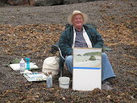
We drove down some narrow paved roads used mostly by local residents and found countless places to paint.  I neglected to bring my camera, unfortunately, so I don't have pictures of Ruth and Howard, but Ruth took these two of me and was kind enough to share them.


I'm using my new EasyL plein air easel for only the second time.  I broke it in on the trip to Bodega Bay and I'm really enjoying it.  So easy to set up and use with the colors right below the canvas and everything right at eye level.  This is a well crafted easel with the outdoors in mind.  I recommend it and plan to do a 'review' on it soon.  As you can see, the day was warm and sunny. 


I wish I had pictures of the others hard at work, but I have only this one of Howard's set up.  He got a very good painting of this scene..


I did two paintings, both unexceptional.  I've become a bit discouraged with my plein air painting...as I believe I'm mentioned in other posts.  Ordinary is the kindest thing I can think to say about most of them. 


I'm hard pressed to find any redeeming qualities in the first painting I did.  The barn in a small valley with morning light coming from the left was a very appealing subject.  Yet the painting missed everything that made the me want to paint it.  Worst of all are the greens in the painting.  Before this effort, I had already realized that I don't understand green, how to see it, how to mix it, how to vary it with the light.  After this poor effort, I am resolved to begin a small study on green in painting. 


This small 9 x 12 painting was marginally more successful.  If nothing else, I got a bit of atmosphere and space in it.  The greens are a bit better asl well, although I am aware that the tree on the left wasn't even remotely the color in the painting. 


But mediocure results or not, it was a great day...good friends and spectacular countryside were wonderful...and as my talented friend Ruth Andre would say ..they made for a painting day. 


Sunday, October 17, 2010

A Workshop with David Lobenberg

On Saturday, I took a one day workshop with David Lobenberg at the University Art on Maconi and Fulton, Sacramento.  Although I don't know David or his work, I was intrigued when I received the flyer for the workshop because it was about watercolor on pen and ink sketches using some unusual surfaces.  I haven't painted watercolors in 30 years or more and I've been thinking about trying it once again.  David's workshop gave me the excuse to purchase some basic w/c supplies.


David with some of his work behind him. 

 Using bamboo and reed "pens" we drew (traced) some portraits onto both watercolor paper (140# cold pressed) and on Tyvek, a construction paper with some unusual applications for watercolor.  We used both india ink and an acrylic ink for sketching.  I enjoyed the unpredictable line work that results from using the bamboo and reed pens. 


ink on w/c paper with washes
  First David had us ink some smaller heads and then make value studies with a single color.  He cautioned not to try to "paint" too much, to let the ink do the work.  I did these two studies.  Although I understand the principle of w/c washes, I found myself wanting to draw with the brush ala oil painting.  I had to try to learn to simply wash in the color. 


ink and w/c on tyvek paper about 11 x 14


Then David had us ink a small head onto tyvek.  This is not a material meant for art use.  It has a very impervious surface that resists water.  It does stain, but the color lays on top, giving the opportunity to scrub out sections or lift color with a dry brush.  The technique is unpredictible and a little hard to get used to.....but it can have  interesting results. 
Ink and watercolor on tyvek paper about 18x24


Finally we did a larger ink and w/c portrait on tyvek.  I want to put some glazes on this, which I think the tyvek will allow nicely.  The entire face is in shade with light falling only on the tip of the nose and around the mouth area.

I'm not sure I would try tyvek again....at least not until I have some more conventional w/c under my belt...but I did enjoy the workshop and trying some new things.  I also reacquainted myself with an old friend.  I look forward to more watercolor painting soon.

Tuesday, September 21, 2010

Back to Bodega Bay

Once again I joined Howard Rees and a group of artists on his annual workshop to Bodega Bay and Tomales California.  This year the weather was spotty with mostly foggy and cool days.  We did have occasional sun and big clouds, but for the most part, we had to contend with the challenging conditions that heavy overcast brings.  Without light for contrast and color, most paintings become a study in gray.

The first day was along Bodega Bay painting the boats at dock.  A pleasant surprise occurred when a homeowner who lived nearby came out to see us and ended up purchasing my first painting of the trip.
First Painting of Trip, Purchased on location by resident (9x12 oil)


9x12 oil on canvas panel


With that very flattering start to the day, I had a bowl of very good clam chowder and then did this view of the same dock area in the afternoon.  I liked both of these paintings and felt that it had been a very good painting day. 


Schoolhouse beach, 2nd painting of the second day.


Our next day was a visit to Schoolhouse Beach just North of Bodega Bay.  It was foggy all day, but not too cold. I painted two scenes that day. 
Schoolhouse Beach  1st painting of the second day.


The first, a study of rocks along the shore, started out with promise, but I lost it somewhere along the way.  To make it worse, I succumbed to the temptation to add a half hearted wave breaking against the foreground rock.  Pathetic.  However, I think I am going to revisit this painting soon and see if I can't save it.  I think if I push the background rocks a little further away and create a bit of surf between the front and rear rock groupings, I may end up with a passable study.  The second painting of the day was of a point jutting into the ocean.  Once again, I think I can "finish" this painting with some bolder strokes in the land mass, giving weight and dimension.


Bodega Church  12" x 16" oil on canvas
 Day three found our group in Bodega, at the scene of the schoolhouse and church used in the film "The Birds"  I painted the church against my better judgement and ended up with a predicable result.  I should have rendered the entire scene much more impressionistically...and I may return to do that.  Finally, I turned my easel 180 degrees to paint a very small study of a fence running beside the road.  Howard helped me pull it off when he suggested a lighter background and also added the hot splash of light at the bottom center of the painting.  A nice study, in my opinion. 
Fence in Bodega  Oil 6"x6"


9 x 12 oil on canvas panel
On the last day of our workshop, the sun was out briefly in the morning, and I painted this scene on the main street of Tomales.  My goal was to capture the very impressive tree, with the barn as a secondary interest.  I totally missed the massive size and presence of the clump of trees and floundered with the colors of the foreground.  These was probably the least successful of all of the paintings on the trip.  I'm not sure it's worth the effort, but I may try to either 'fix' this one up or paint another version with this as a study in what not to do.  Although I was running out of gas artistically I decided to try one more as the fog settled into the valley once again.  This charming cluster of buildings could be seen from the front of the Shoreline School District.  Once again, the subdued colors and lack of contrast were a challenge as I resisted the urge to add bolder colors.  The workshop gathered for one last critique, and it was time to head home. 
Tomales Valley Scene  8 x 16 oil on panel
 The Workshop participants:

Howard Rees
Rusty
Ted
Norm

Renee
Vicki
Kathy and Sierra


 A good trip with wonderful people and artists!!

Friday, August 13, 2010

Painting at the School of Light and Color

Have you ever heard of "Meetup.com"?  I recommend checking it out if you haven't.  No matter what your interest, you're likely to find a group there.  Biking, hiking, knitting and of course, art, are just a few.  I have belonged to the Sacramento Plein Air Painters Meetup group for awhile now, and I've enjoyed many outside painting sessions with friends and fellow artists as a result.  Recently a new group was formed called "Sacramento Figure Drawing Group".  I joined with the hope of finding more opportunities to paint models and portraits from life.  Today I went to the first session I was able to make.  This one was at the School of Light and Color, a place I've heard of many times, but have never visited.  It was a good session with a very good model and many talented artists.  I wish I could name them all...and I look forward to the time that I can, but I did meet Susan Sarback, owner of the School and very gifted painter, as well as Terry Muira, whose work I have long admired.

My effort today was OK, especially given that it's been six months since I've done a portrait / figure from life.  Thinking about it, it's probably closer to a year, if the truth be told!  The Model was really exceptional.  I don't remember her name, unfortunately.  I went through the regular self conscious jitters that I often feel when studio painting with others and this was magnified by the level of talent in the room, but I soon got lost in the challenge of painting from life.  It's always a great experience...and often quite humbling.  I look forward to next time.


Oil on stretched cotton canvas, acrylic primer.
16" x 20"
About 2 1/2 hours.